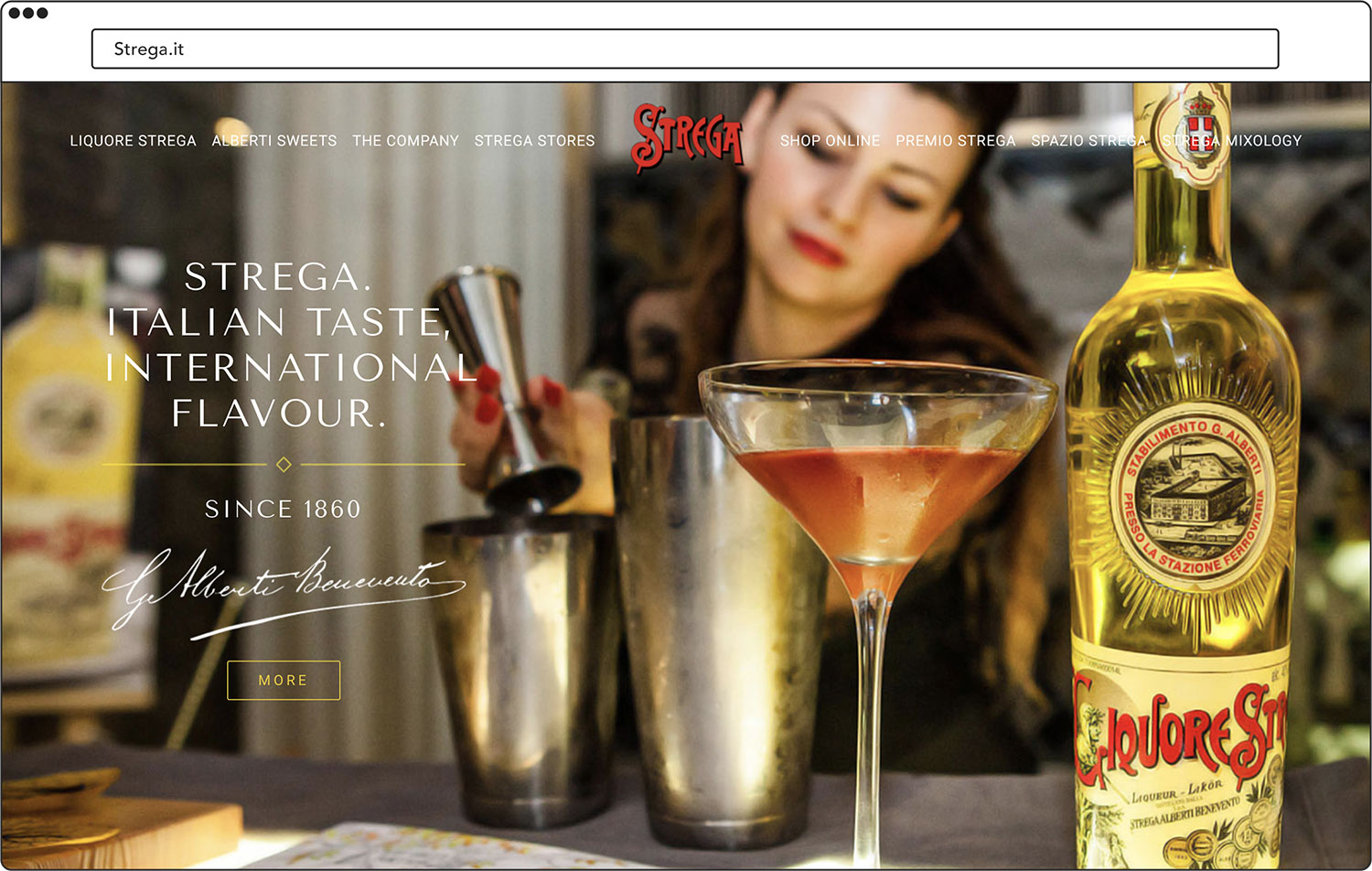
Strega
Packaging design, Digital Experience
This work is a commission for Creativa NY,LLC. Design partner for this project is Carmine Savarese.

The Witch
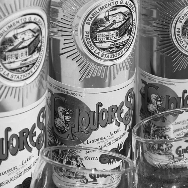
Strega is an Italian liqueur and sweets company with over 150 years of history. Their name means The Witch, inspired by the local legend.
Based in Benevento, they are known for their unique herbal and spicey taste, made from selected ingredients. To keep up with the saturated market of liqueur, they needed a more updated looking design that still speaks to their heritage.
Strega Baba
For this packaging, we decided to take a bold move to step away from traditional looking packaging. The hand-drawn lettering used to emphasize the strong and rich taste Strega Baba has compared to other brands.

Limoncello di Sorrento
Limoncello is a typical Italian liqueur. Strega wanted a packaging that speaks to the authenticity of limoncello which lemon comes especially from Sorrento. For this product, we want to attract more people with taste in style.

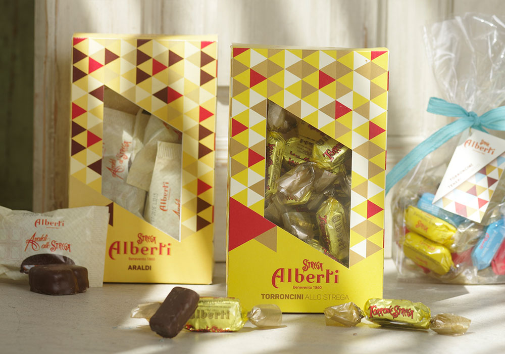
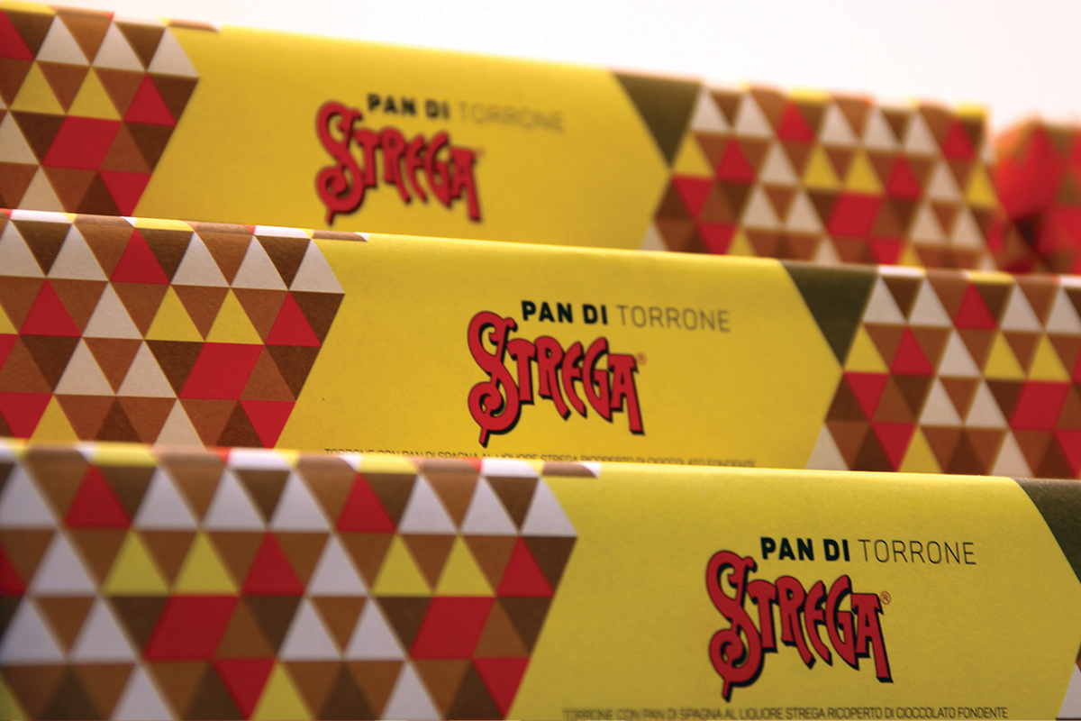
Pattern design
Other than to have a uniform look and feel across a wide array of products, this series of packaging design intend to shift their image from traditional to modern to appeal to target younger consumers.